Project Overview
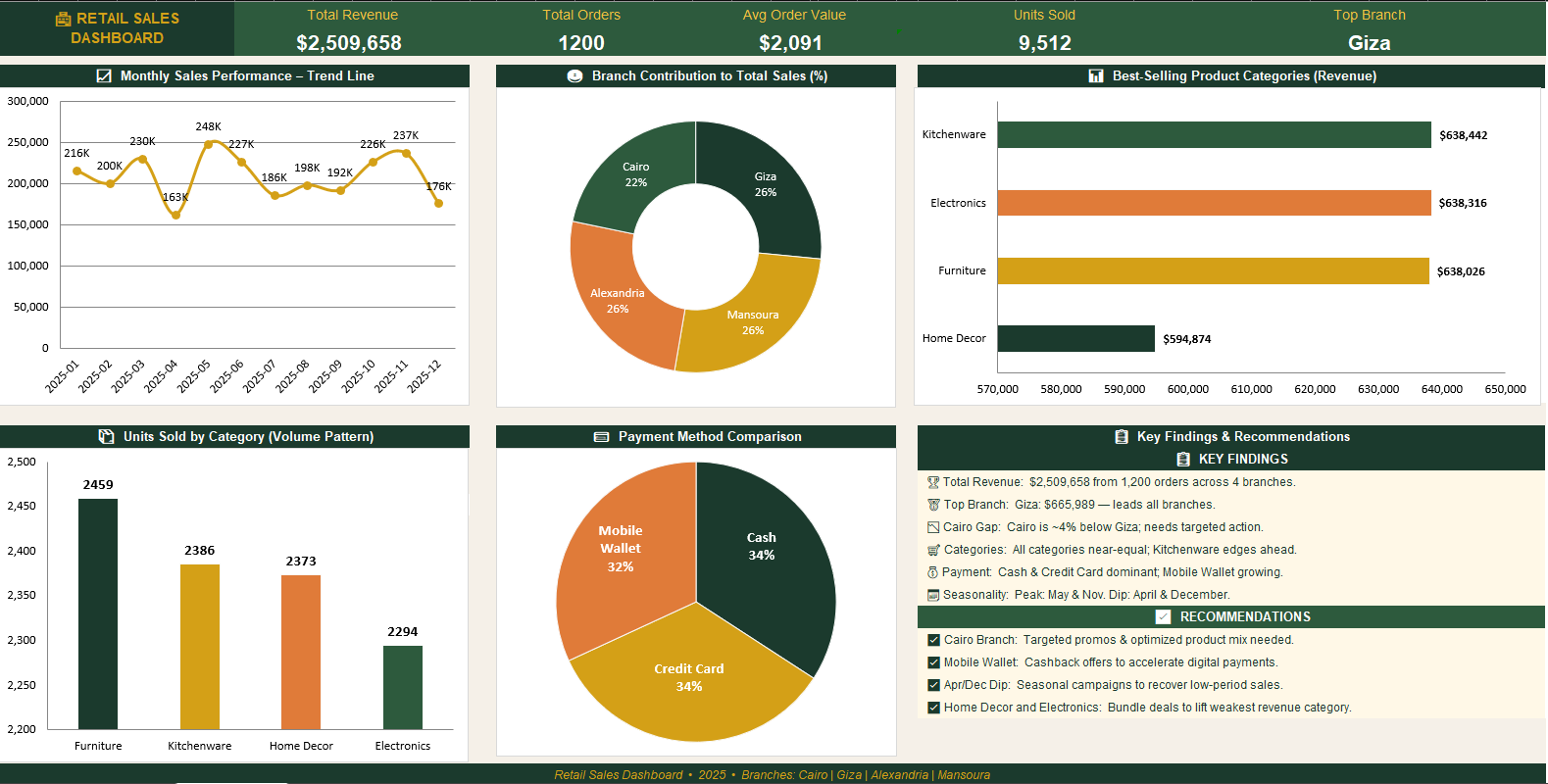
The dashboard uses a variety of Excel visualizations, including KPI cards, trend lines, bar charts, donut charts, and comparison charts, to present sales data in a clear and easy-to-understand format.
These visual elements allow users to track monthly performance, compare branch contributions, analyze product category results, and understand payment method distribution more effectively.
The layout was designed to make insights accessible at a glance, helping decision-makers quickly identify trends, evaluate branch performance, and focus on key business opportunities.